A brand identity for a German language school in Berlin: one voice that welcomes people from every language.
Personal project · language school · Berlin
Brand identityLogo designPrintDigital
Role
Graphic Designer
Type
Personal project
Scope
Logo, colour, type, visual elements
Applications
Print and digital
(The question)
How do you give a language school one voice in a city that speaks so many languages?
(The story in 28 seconds)
From Problem to Solution
01 · The problem
A short brand film. Grey speech bubbles saying hello in many languages crowd the screen and gather in the middle. Six coloured speech bubbles fly in and overlap into the Sprachschule mark, and the wordmark appears below it. Then the identity is shown on a poster, business cards, a tote bag, a brochure, a phone and a website, and the film ends on the white logo on dark blue.
01 · The problem
Many Languages, No Single Voice
Berlin is home to people from all over the world, each with their own language.
A language school has to feel open and welcoming to all of them, before they speak a word of German.
It needs an identity that is clear, friendly and easy to recognise on every surface.
The solution
Speech Bubbles That Spell the Name
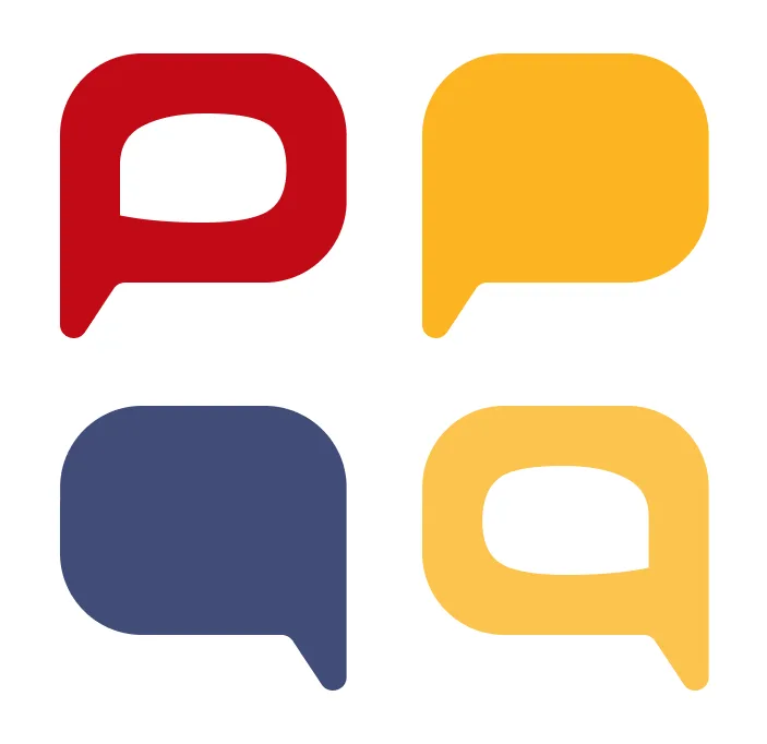
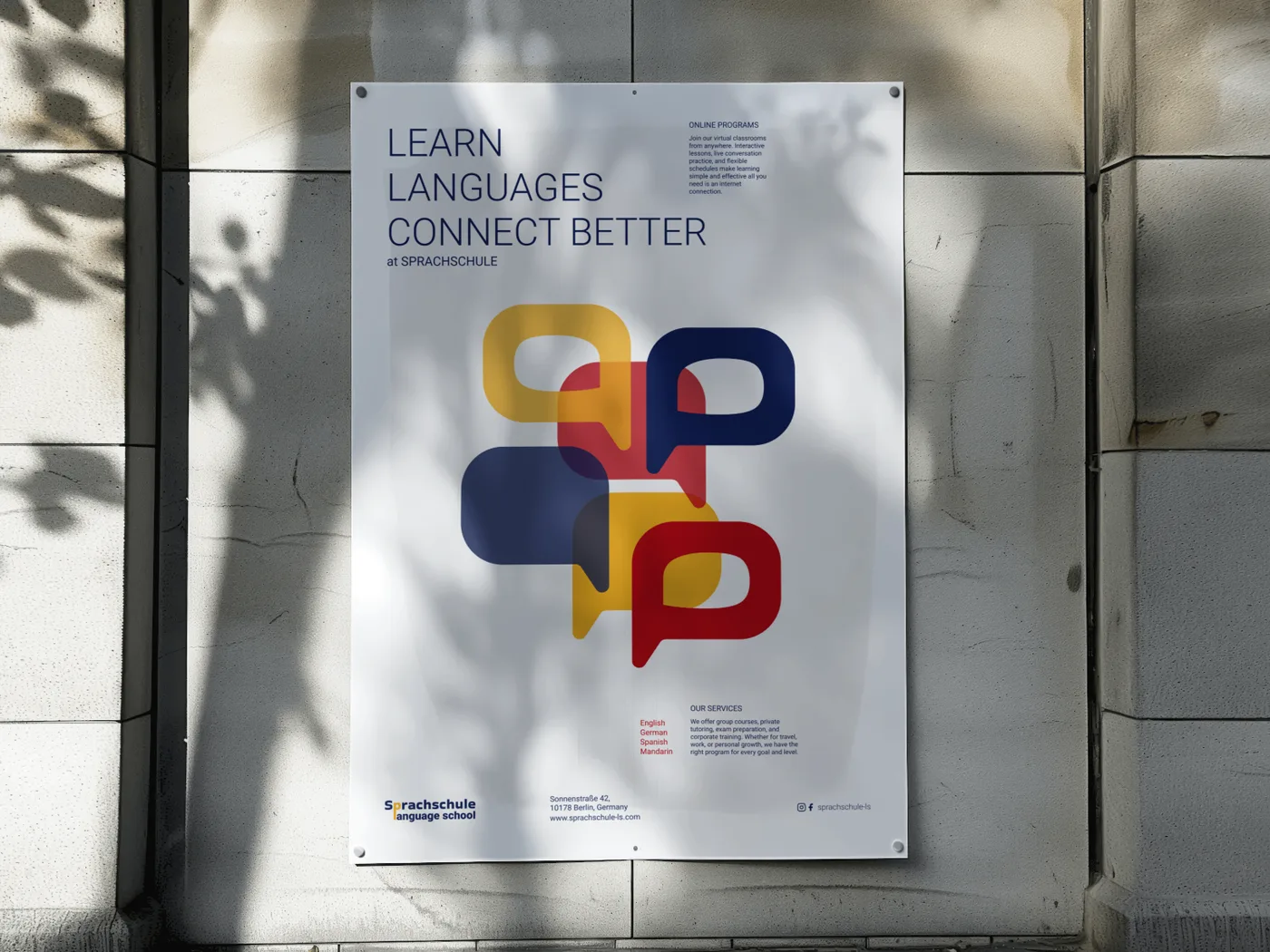
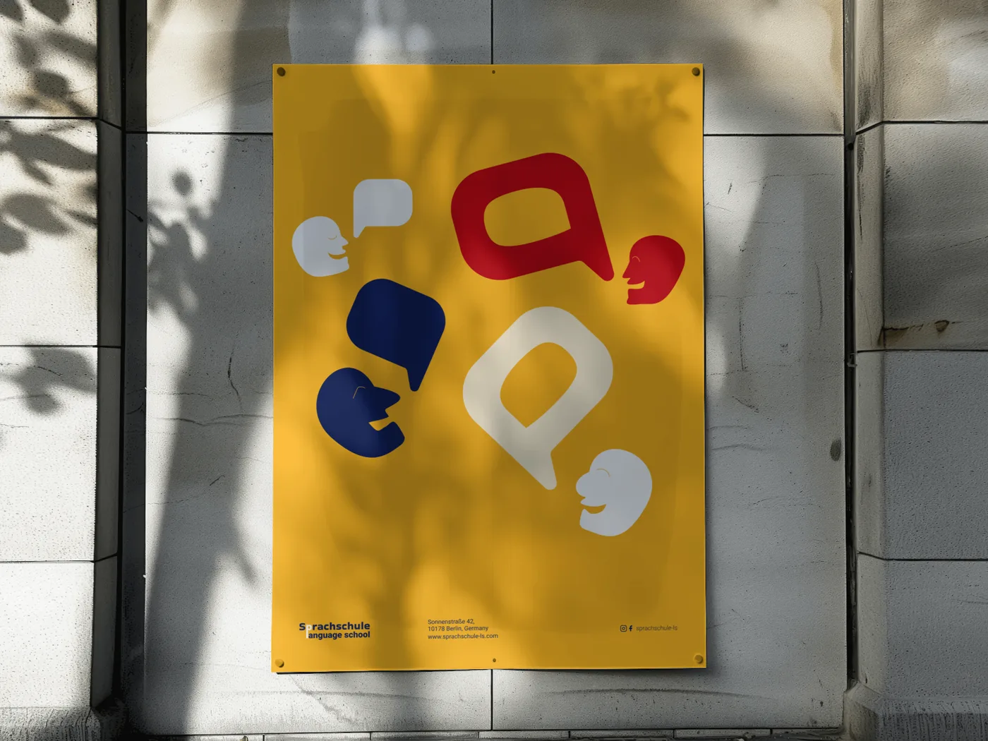
The p of Sprachschule is a speech bubble: the name itself starts a conversation.
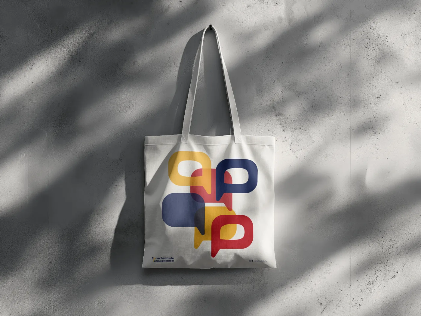
Bubbles in yellow, red and blue overlap like voices in a conversation.
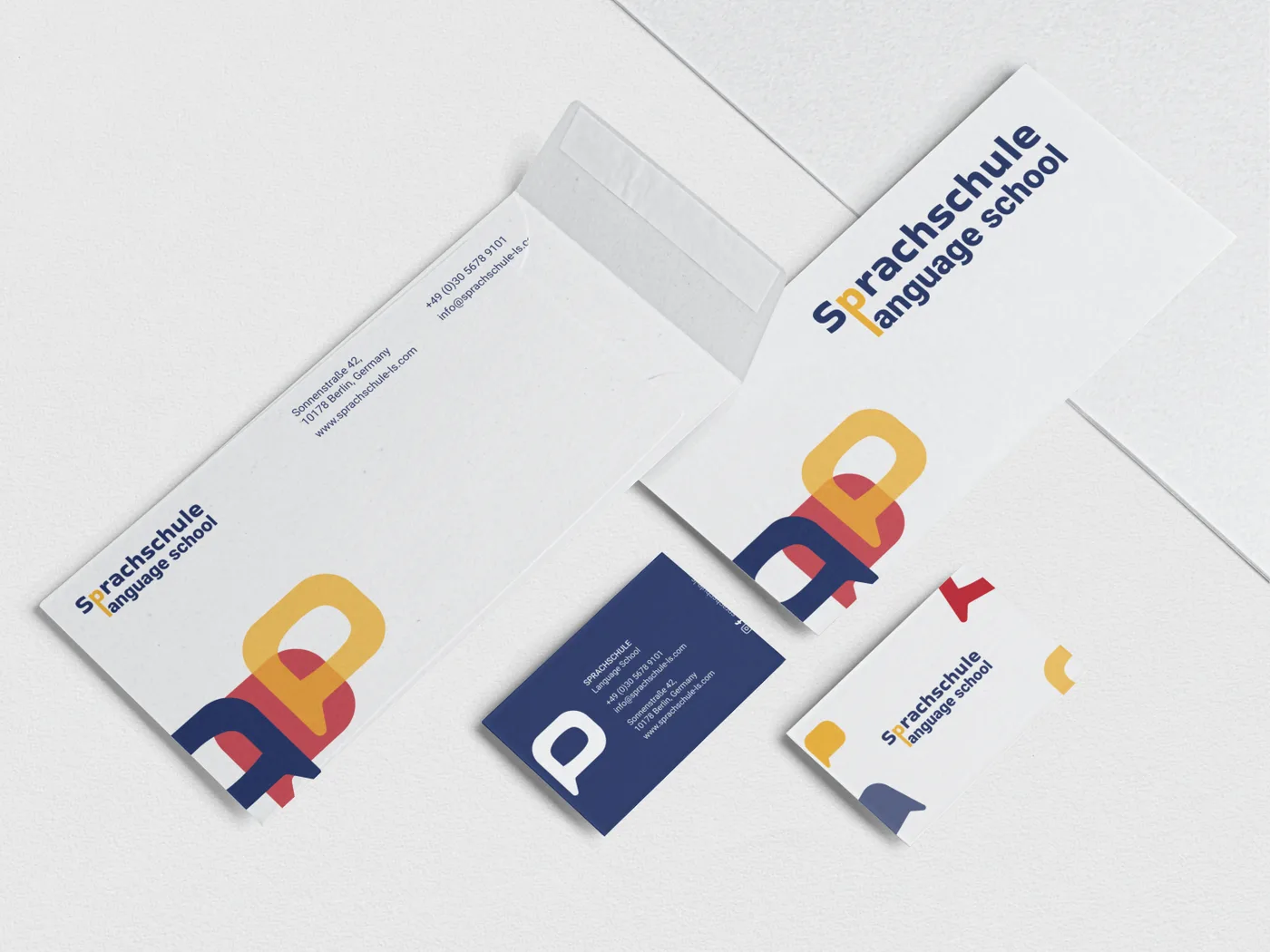
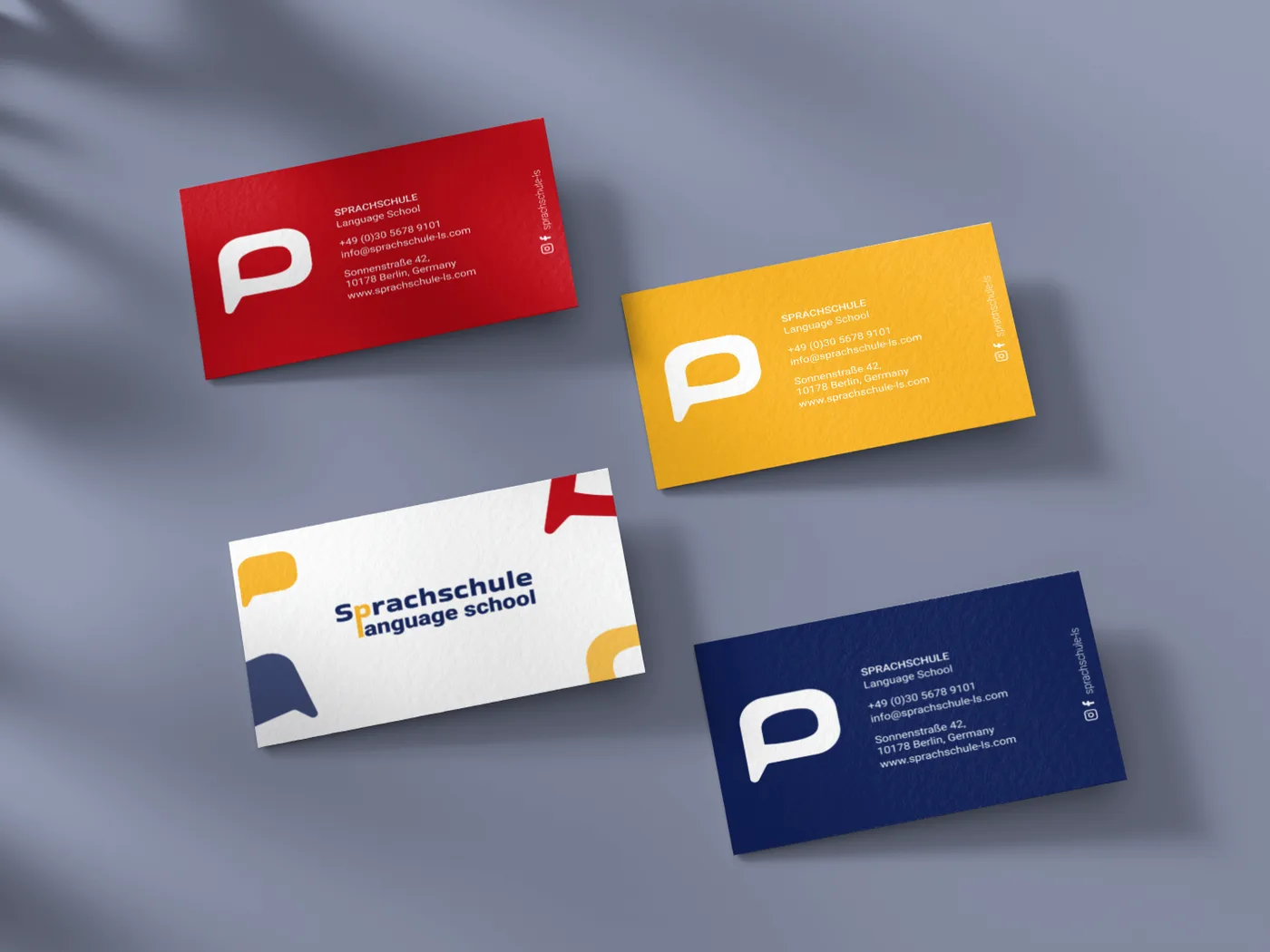
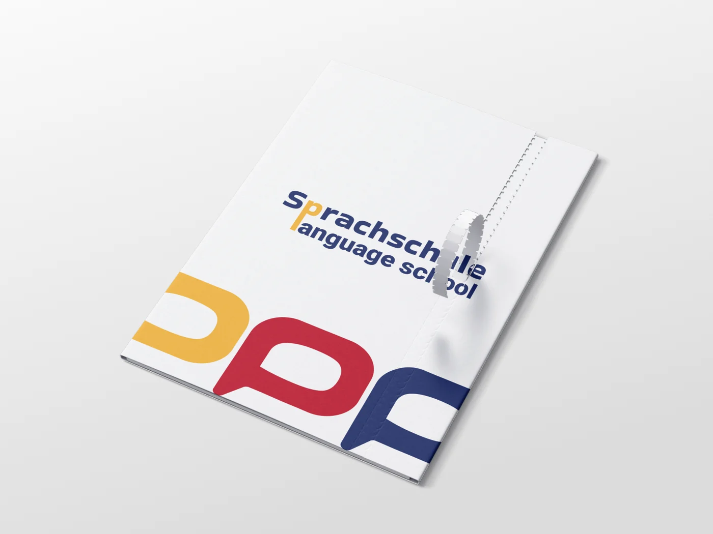
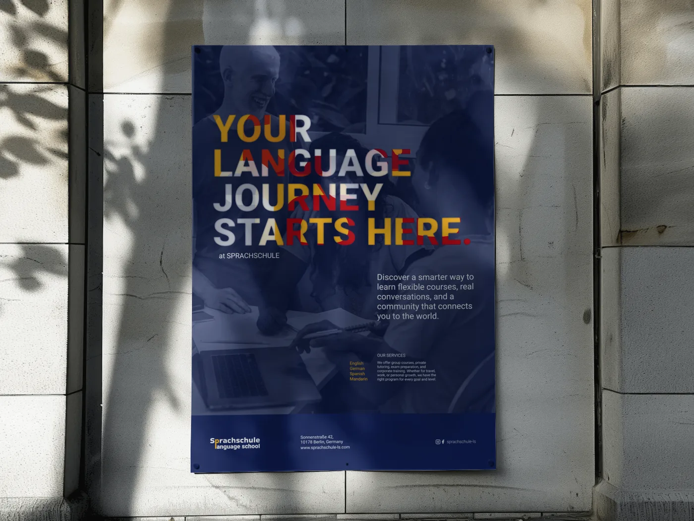
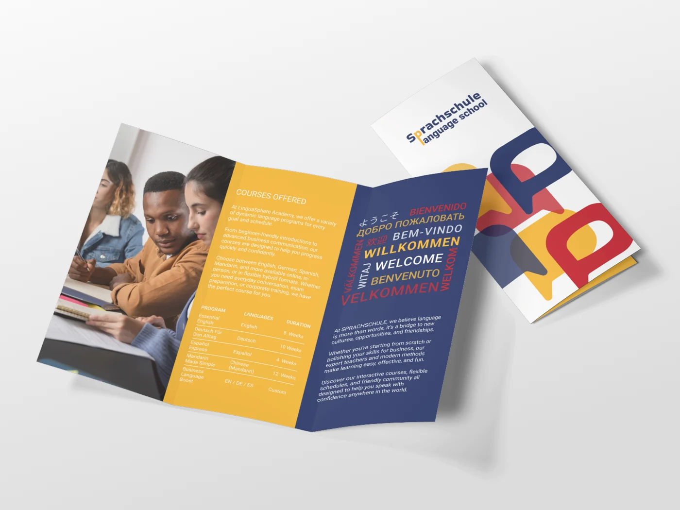
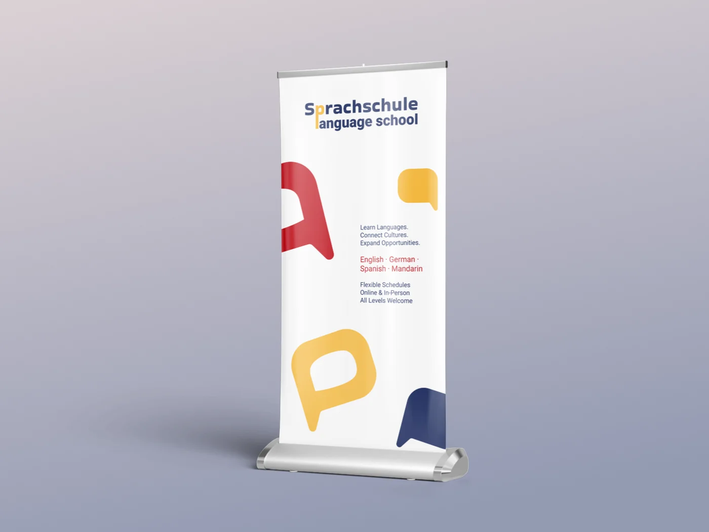
One flexible system for stationery, posters, signage and the web.
Context
The brief
Design the complete visual identity of a German language school in Berlin: logo, colour, typography, visual elements and the main applications.
Audience
People from many countries who want to learn German in Berlin, and need a place that feels friendly and trustworthy from the first contact.
Goal
An identity that feels open and international, rooted in Berlin, and simple enough to stay recognisable at every size.
Note
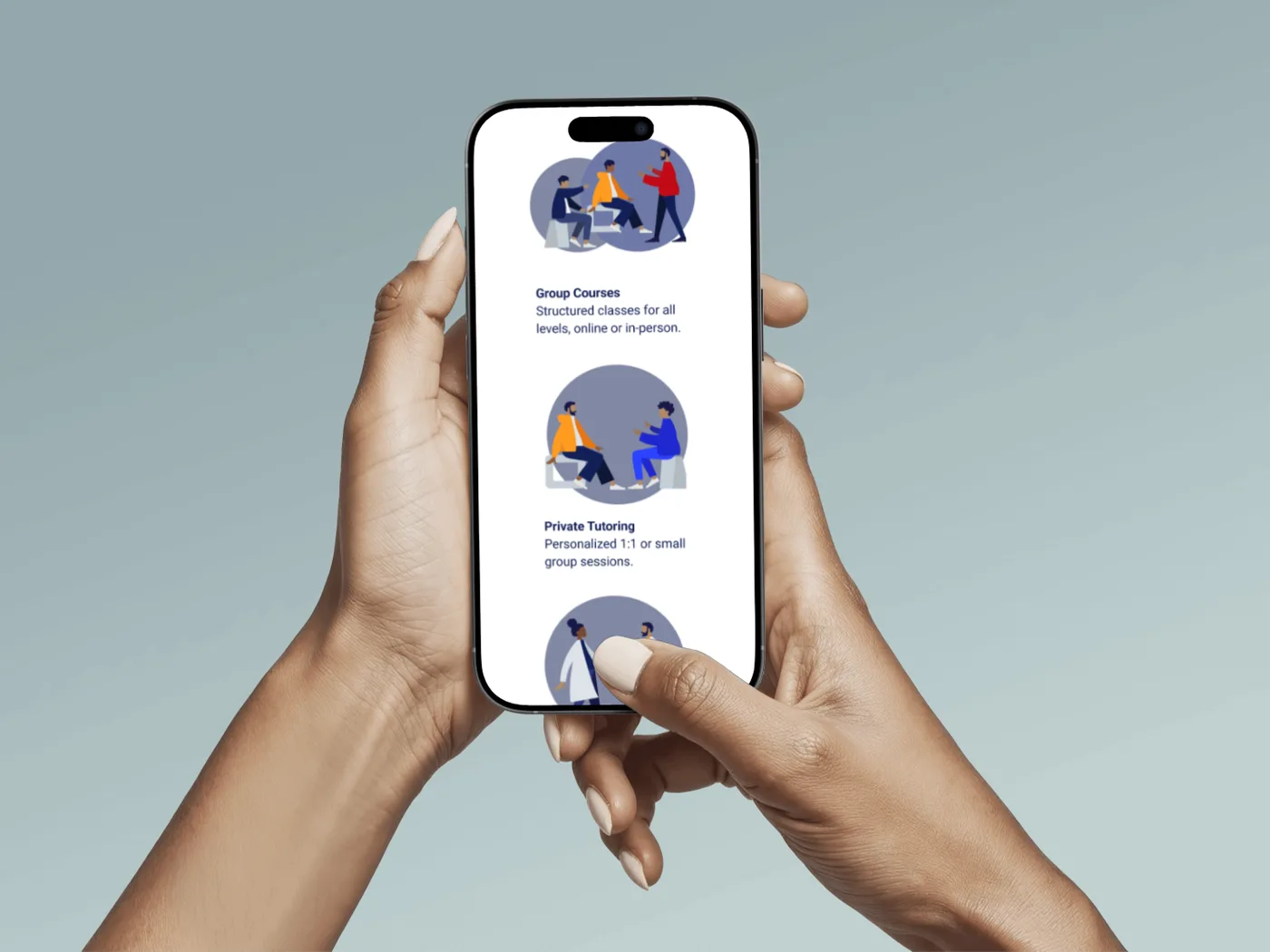
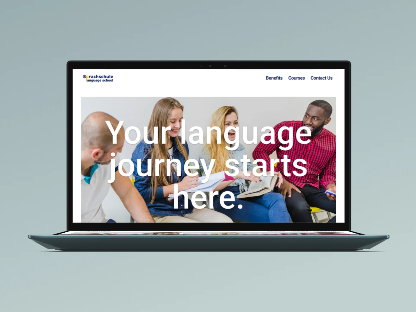
A personal project. I designed everything except the illustrations of people, which come from a free template, and the photos of people in the brochure, posters and website, which are stock images.
02 · My role
Graphic Designer
I created the whole identity on my own: research and moodboard, the logo and mark, colour and typography, the visual elements and every application, from business cards to the website.
03 · Process
Moodboard → Logo → System → Applications
Moodboard: Berlin as the Starting Point
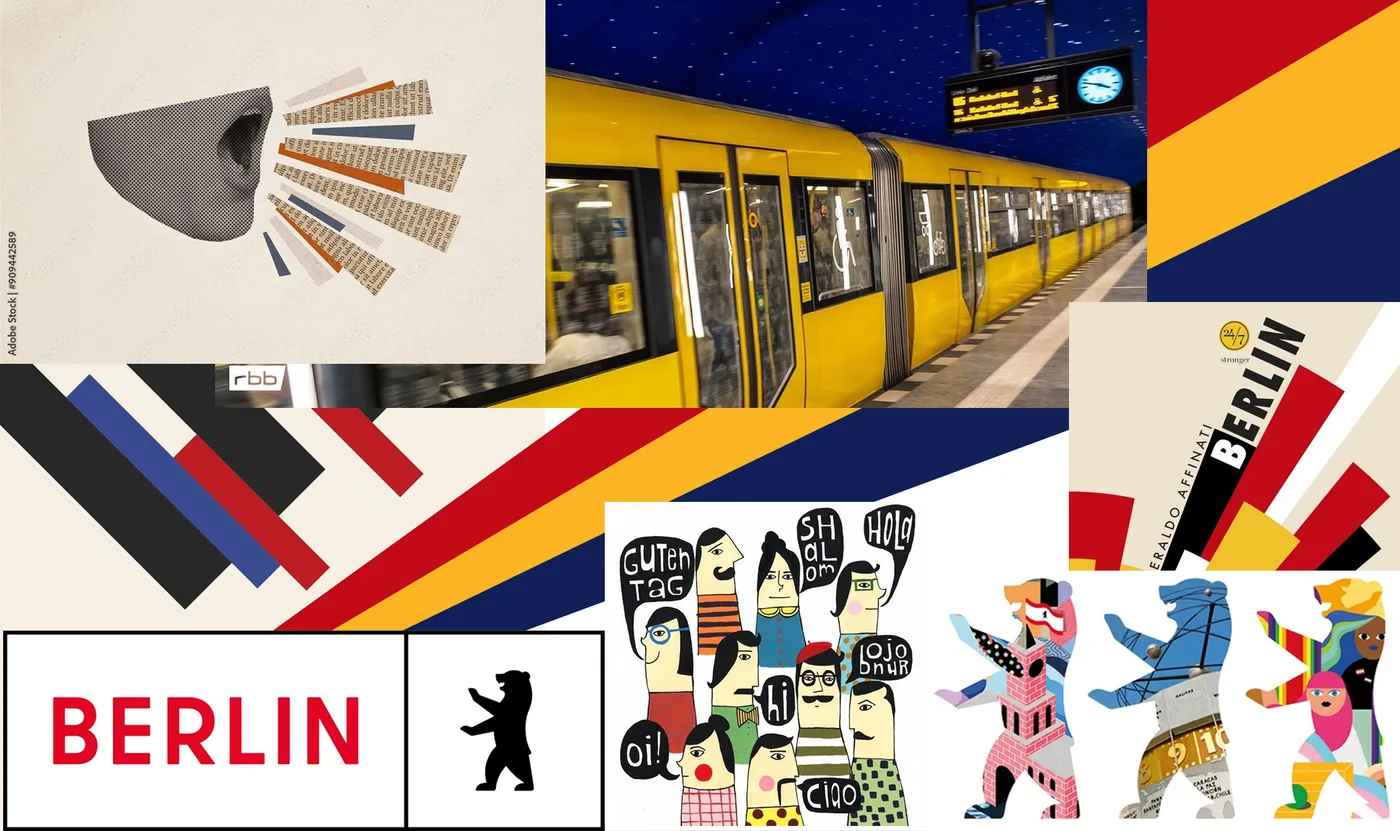
The moodboard draws on the city: its yellow U-Bahn trains, the red of Berlin, bold graphic shapes and playful characters.
References: Berlin's colours, transport and street culture.
Logo: From Typeface to Mark
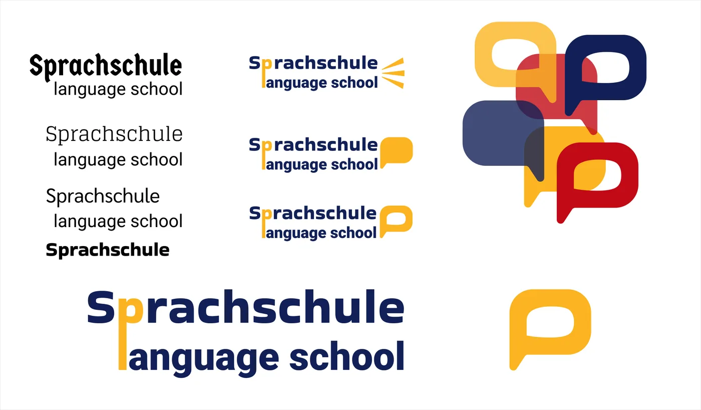
I tested typefaces from blackletter to a geometric sans, and chose a bold, friendly sans. The p of Sprachschule became a speech bubble, and the l of "language" a yellow bar that links both words.
Typeface explorations, wordmark versions, the final logo and the mark.
Colour & Visual Elements
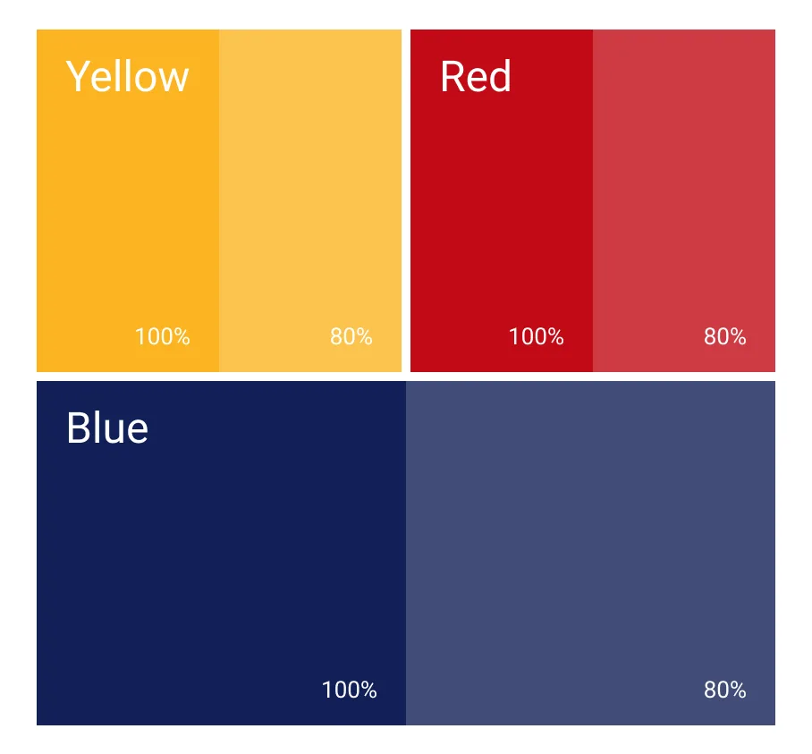
Yellow, red and blue, each with an 80% tint, give the system warmth and energy. The speech bubbles, as p and q, solid or open, become a flexible graphic language.