Templates live outside the toolCopied from GitHub by hand.
Many manual stepsFind, copy, format: for every export.
01 · The problem
A functional tool nobody enjoyed using.
02 · The solution
Find a project, add it to the export list, choose the template. Done.
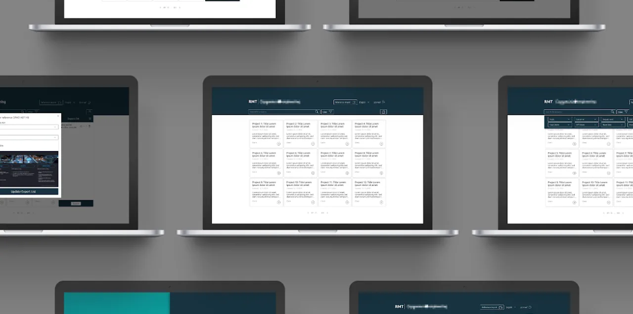
First, a reconstruction of the old tool: a plain table of projects with no hierarchy and presentation templates kept in a separate GitHub folder. Then a recording of the redesigned tool: login, the project dashboard, adding a project to the export list and choosing the template language and slide type with a live preview.
01 · The problem
A Functional Tool Nobody Enjoyed Using
A rudimentary interface with only functional components and no visual hierarchy: every project looked the same.
Presentation templates were taken from GitHub, outside the tool.
Finding, collecting and exporting references took many manual steps.
The solution
One Calm Place to Archive, Find and Export
A searchable dashboard with clear project cards and filters.
An export list: add projects, set each one up, export them together.
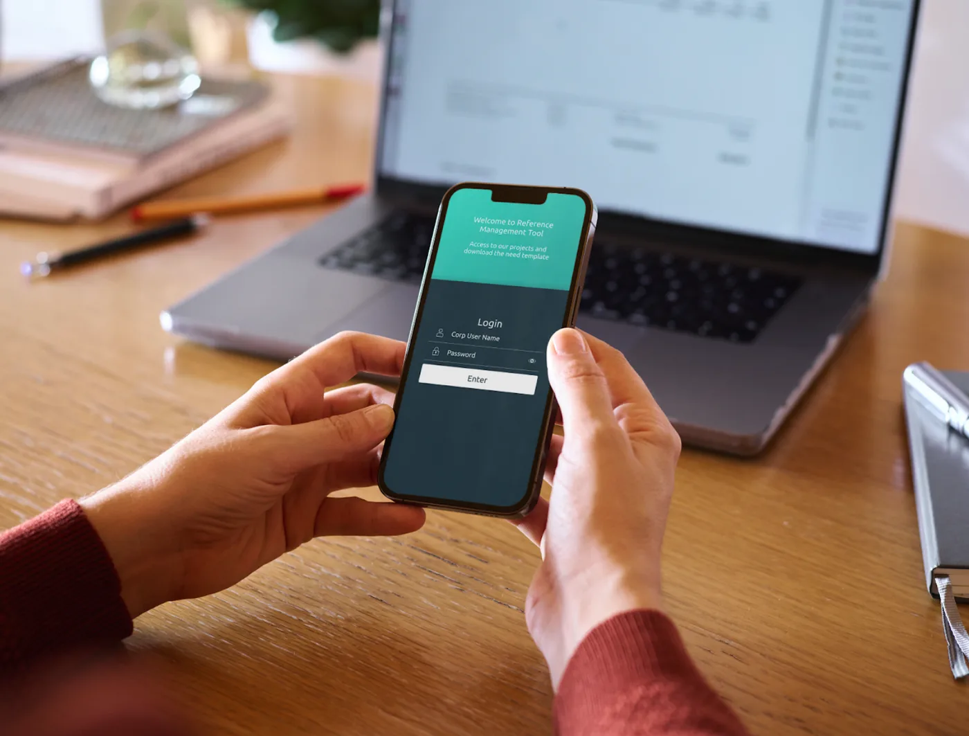
Templates built in: choose language and slide type, preview, download.
Context
Product
A B2B platform where company managers upload, store and manage project information, and export it as downloadable templates for internal and external presentations.
Users
Company managers who organize, find and share project data, from people comfortable with complex workflows to those who prefer simple, guided steps.
Business goal
Align the platform with the company's brand, make daily project management easier, and build a scalable design system for future growth.
Constraints
Simplify complex information hierarchies into clear flows.
Stay consistent with the existing company style guide.
Responsive prototypes for every key screen size.
Close collaboration with stakeholders and developers.
The challenge
Four Things to Solve at Once
Visual inconsistency
The platform had no shared visual language, so it felt fragmented for managers handling many projects.
Complex information
Project data had several layers of content that had to be clear without overwhelming anyone.
Brand alignment
The redesign had to respect and extend the company style guide while modernising the interface.
Handoff accuracy
Design intent had to reach development intact, which needed thorough documentation and close collaboration.
02 · My role
Product and UX/UI Designer
I worked in a team with a project manager, a product owner and three developers. I led the research, the visual system, the usability testing and the handoff, designed new features for the platform, and brought stakeholder feedback into every iteration.
03 · Process
Research → Ideation → Implementation → Specifications → Handover
Research & Visual Grounding
Desk research on design trends and best practice in B2B platforms.
Mood boards to explore visual directions within the company brand.
Competitor analysis to find strengths and gaps, synthesised into a clear visual direction.
Ideation & Stakeholder Alignment
I turned the research into design concepts together with the stakeholders, around three questions:
How much information density is right without overwhelming managers?
Which flows need simplifying to reduce friction in daily tasks?
Which elements matter most for the platform's core functions?
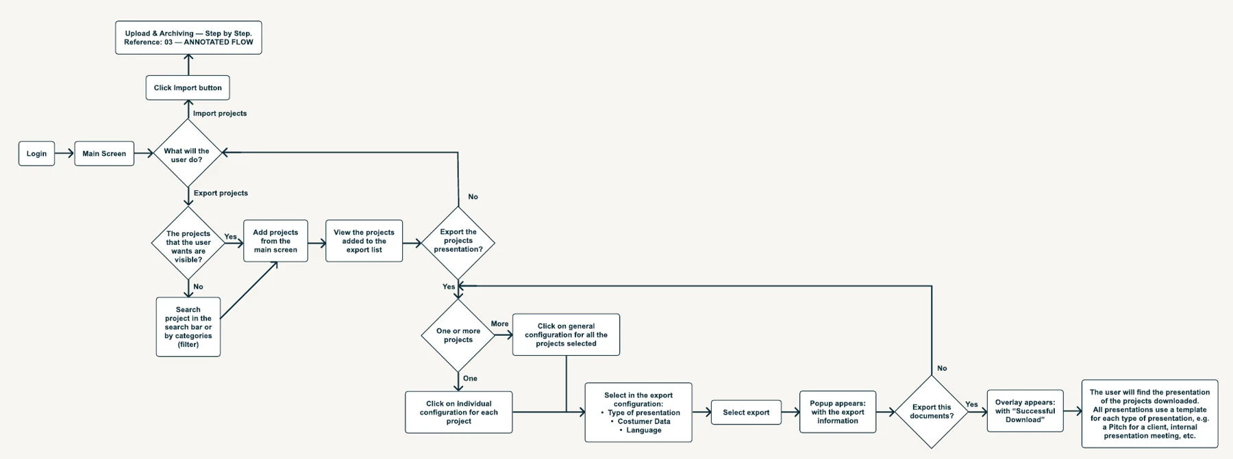
The main screen flow: import a project, or find projects and export them as presentations.
Wireframe → High Fidelity
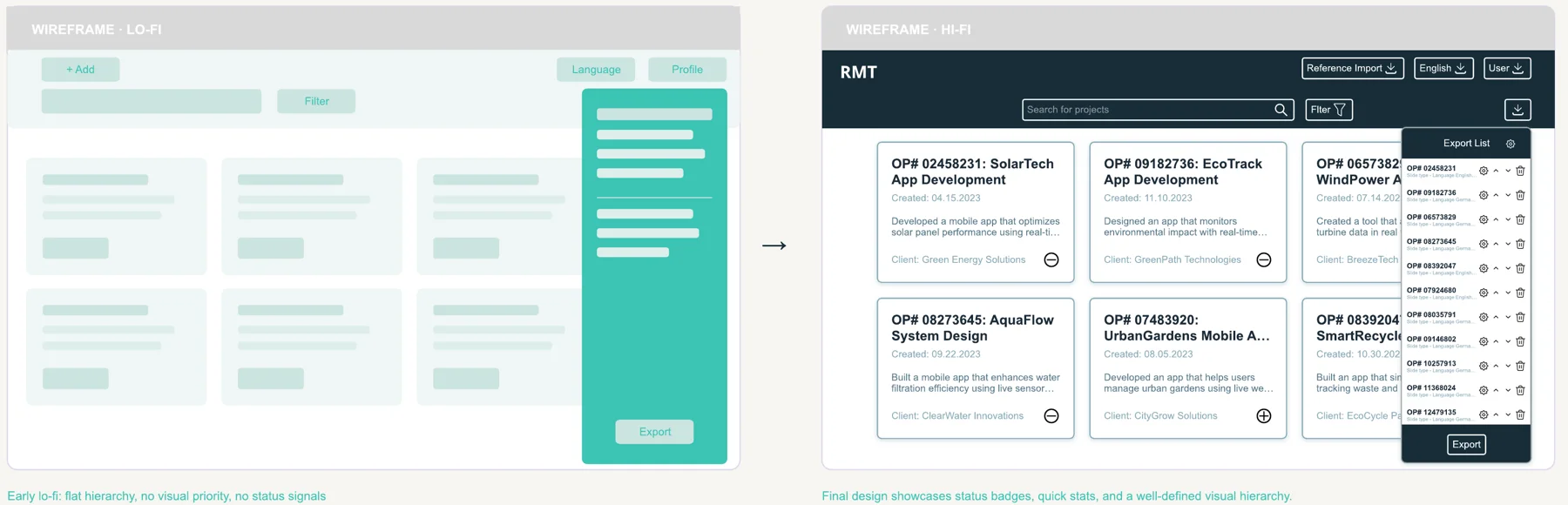
Early lo-fi had a flat hierarchy and no status signals. The final design adds clear project cards, quick actions and a strong visual hierarchy.
Design System First
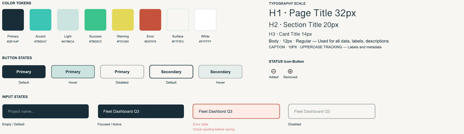
I built the component library before the screens. That decision made handoff faster.
Colour tokens, type scale, button, status and input states.
Exploration · not implemented
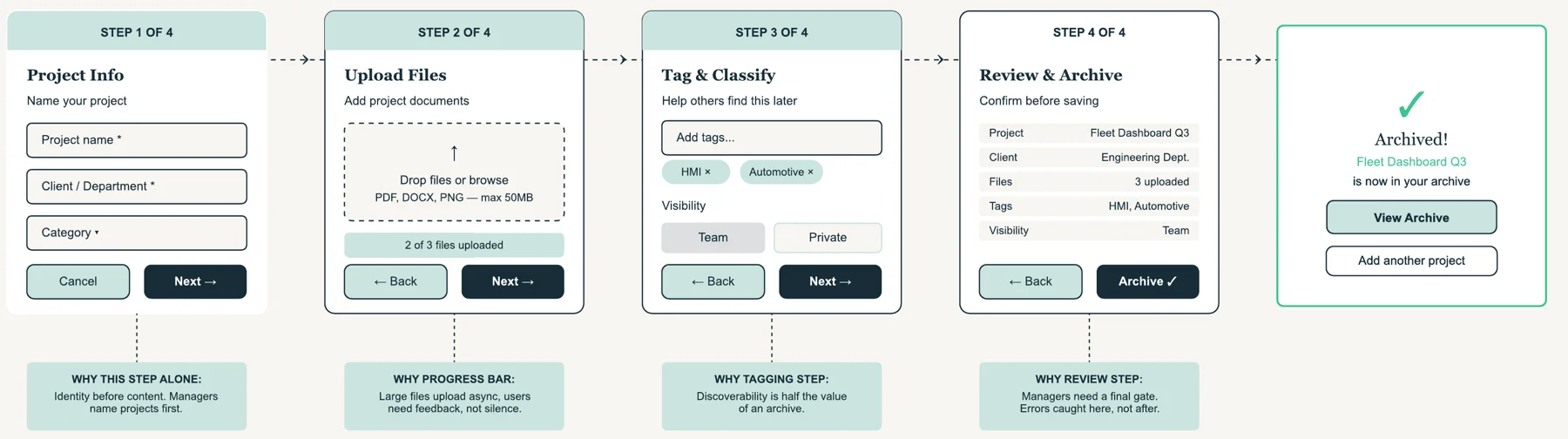
Upload & Archiving, Step by Step
The brief asked for one long form. I explored splitting it into four steps that follow how managers think about project data.
Identity before content, visible upload progress, tags for discoverability, and a final review before archiving.
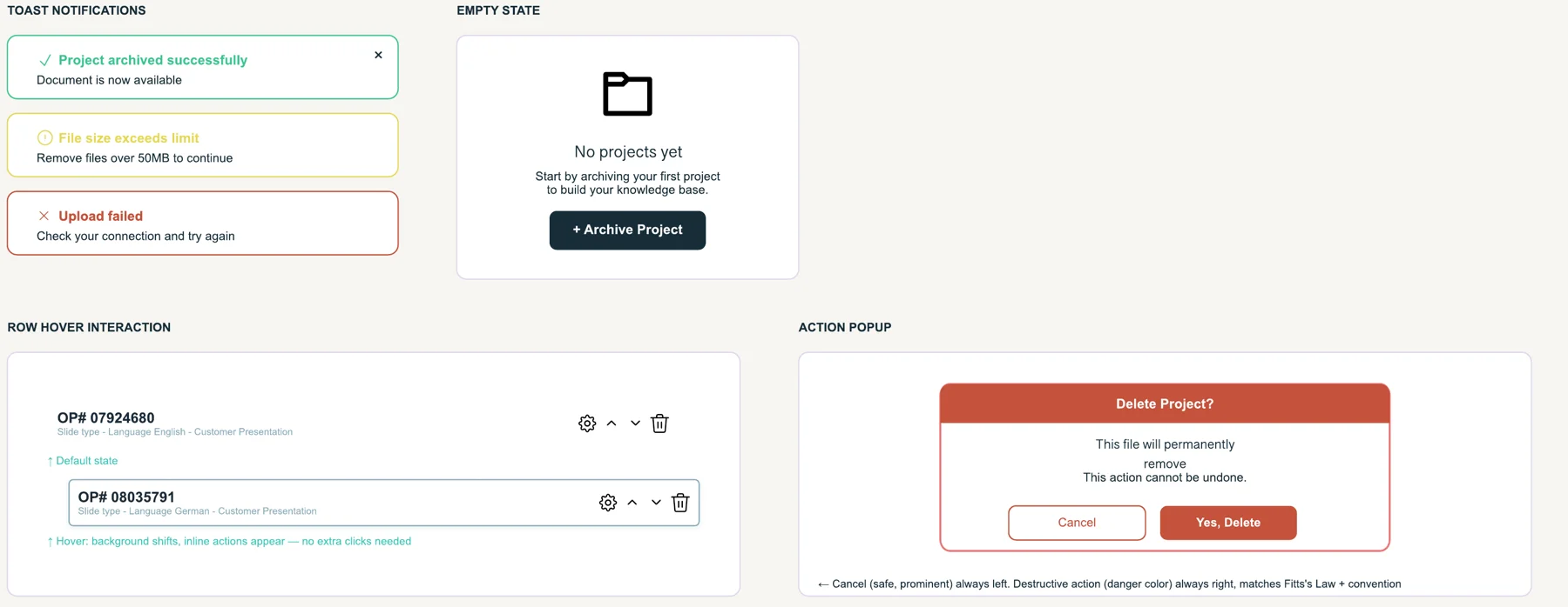
Micro-interactions & Edge Cases
The details that build trust: clear feedback, a helpful empty state, inline actions on hover, and a safe delete dialog.
Usability Testing & New Features
I ran the usability tests and turned what we learned into new features for the platform.
Specifications & Developer Handoff
I documented components, states and interactions in detail so the team could build the design exactly as intended.
The solution
Final Screens
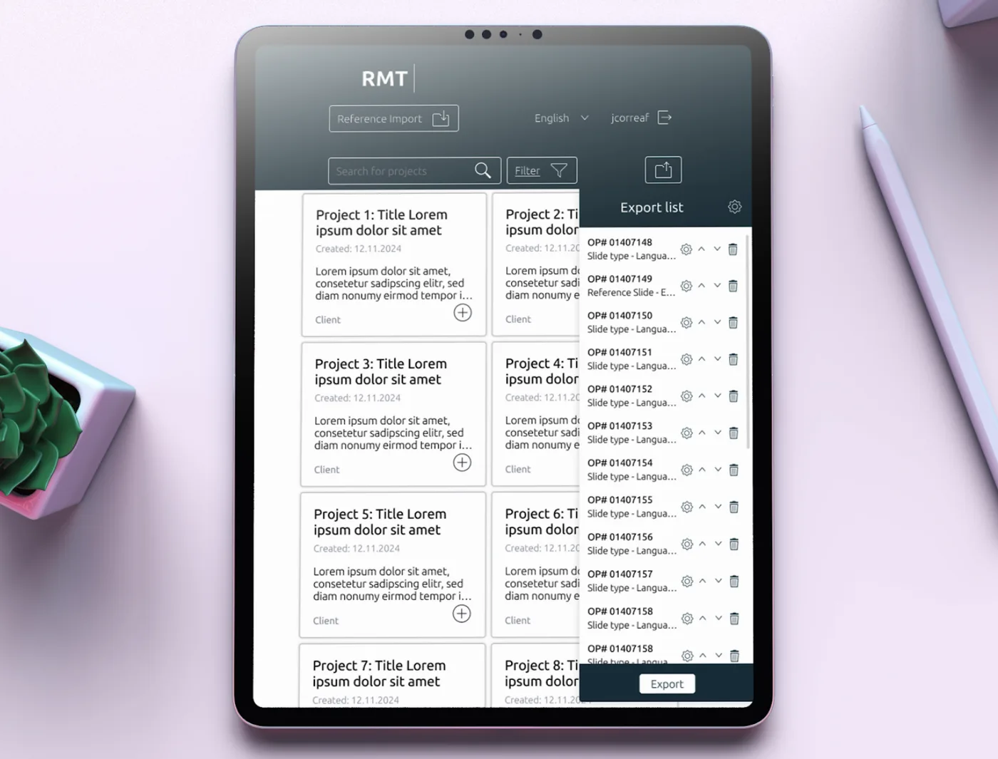
Dashboard & Export List
All archived projects in one place, with quick actions to add them to the export list.
WhyA strong visual hierarchy lets managers scan and find projects at a glance, with less effort in busy workflows.
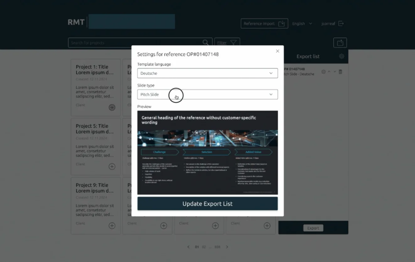
Template Export
Each project can be set up individually: template language, slide type and a live preview before export.
WhyClear formatting options make every export presentation-ready with minimal effort.
Responsive by Design
I advocated for full responsive coverage, from desktop to tablet and mobile.
WhyManagers check and share references on the go, not only at their desks.
04 · Outcome
What Changed
The platform now has one coherent visual system across every module, and the team ships design changes faster. This was the first delivery: I kept working on the next iterations of the platform.
40%less design-to-development handoff time, measured by the team, thanks to the component library
30+screens with one consistent visual identity across all modules
3rounds of stakeholder feedback built into the design
05 · Reflection
What I Learned
B2B design means balancing business logic with simplicity: managers need power and efficiency, not decorative complexity.
A component library from day one kept every screen consistent and made handoff much faster.
Regular prototypes and feedback loops matter: small issues in wireframes became clear usability problems in high fidelity.
Treating the company style guide as a constraint, not a limit, led to a more focused result that felt native to the brand.
Good project structure and planning kept the team and its activities in sync, made the work efficient and led to a better product.